Gradient
gradient 속성은 2가지 이상의 색상을 혼합하여 색감의 배경을 생성하는 속성이다. gradient에는 2가지 종류가 있다.
- Lineal-gradient(선형)
- Radial-gradient(원형)
linear-gradient
linear-gradient 속성은 선형 그라데이션 효과를 만든다.
linear-gradient(direction, color1, color2 ...)direction 은 방향을 의미하며 값은 아래와 같다.
| 값 | 설명 |
|---|---|
| to bottom | 위에서 아래로(기본값) |
| to top | 아래에서 위로 |
| to left | 오른쪽에서 왼쪽으로 |
| to right | 왼쪽에서 오른쪽으로 |
| to bottom right | 대각선, 좌상단에서 우하단으로 |
| n deg | n도의 방향 |
<html>
    <head>
        <style>
            div {
                height: 50px;
                padding: 20px;
                margin: 10px;
            }
            .li1 {
                background: linear-gradient(to bottom, red, tomato, orange, yellow);
            }
            .li2 {
                background: linear-gradient(to top, red 20%, tomato 50%, orange, yellow);
            }
            .li3 {
                background: linear-gradient(to left, red, tomato, orange, yellow);
            }
            .li4 {
                background: linear-gradient(to right, red 40%, tomato 10%, orange 20%, yellow);
            }
            .li5 {
                background: linear-gradient(to bottom right, red, tomato, orange, yellow);
            }
            .li6 {
                background: linear-gradient(45deg, red, tomato, orange, yellow);
            }
        </style>
    </head>
    <body>
        <h1>linear-gradient</h1>
        <div class="li1">to bottom</div>
        <div class="li2">to top</div>
        <div class="li3">to left</div>
        <div class="li4">to right</div>
        <div class="li5">to bottom right</div>
        <div class="li6">45 deg</div>
    </body>
</html>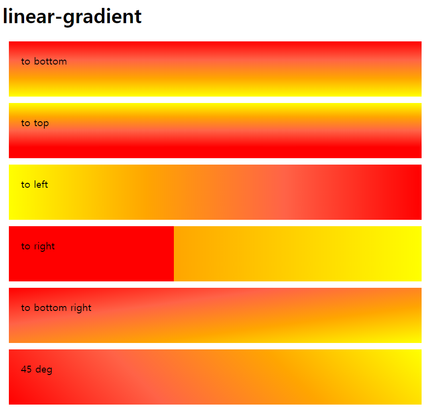
repeating-linear-gradient
repeating-linear-gradient 속성은 그라데이션을 반복한다.
<html>
    <head>
        <style>
            div {
                height: 250px;
                padding: 20px;
                margin: 10px;
            }
            .li1 {
                background: repeating-linear-gradient(red, tomato 10%, orange 20%);
            }
            .li2 {
                background: repeating-linear-gradient(to left, red, tomato, orange 40%);
            }
        </style>
    </head>
    <body>
        <h1>repeating-linear-gradient</h1>
        <div class="li1">1</div>
        <div class="li2">2</div>
    </body>
</html>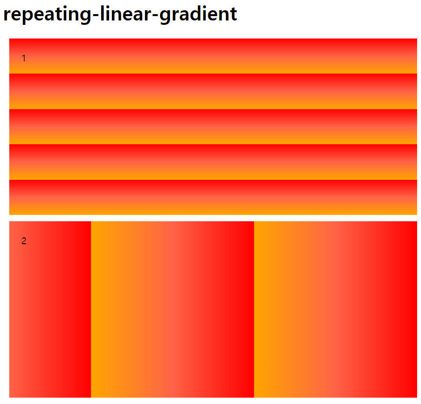
radial-gradient
radial-gradient 속성은 원형 그라데이션 효과를 만든다.
radial-gradient(shape size at position, color1, color2 ...)shape 는 모양을 의미하며 값은 아래와 같다.
| 값 | 설명 |
|---|---|
| ellipse | 타원형(기본값) |
| circle | 원형 |
size 는 원 크기를 의미하며 값은 아래와 같다.
| 값 | 설명 |
|---|---|
| closest-side | 가장 가까운 모서리까지 |
| closest-corner | 가장 가까운 코너까지 |
| farthest-side | 가장 먼 모서리까지 |
| farthest-corner | 가장 먼 코너까지 |
position 은 위치를 의미하며 값은 아래와 같다.
- left, center(기본값), right, top, bottom
- 백분율(%)
<html>
    <head>
        <style>
            div {
                height: 250px;
                padding: 20px;
                margin: 10px;
            }
            .ra1 {
                background: radial-gradient(circle, red, tomato, orange);
            }
            .ra2 {
                background: radial-gradient(at 15% 15%, red 20%, tomato 50%, orange);
            }
            .ra3 {
                background: radial-gradient(circle at right, red, tomato, orange);
            }
            .ra4 {
                background: radial-gradient(closest-corner, red, tomato, orange 20%);
            }
            .ra5 {
                background: radial-gradient(circle farthest-side at 30% 90%, red, tomato, orange);
            }
        </style>
    </head>
    <body>
        <h1>radial-gradient</h1>
        <div class="ra1">radial1</div>
        <div class="ra2">radial2</div>
        <div class="ra3">radial3</div>
        <div class="ra4">radial4</div>
        <div class="ra5">radial5</div>
    </body>
</html>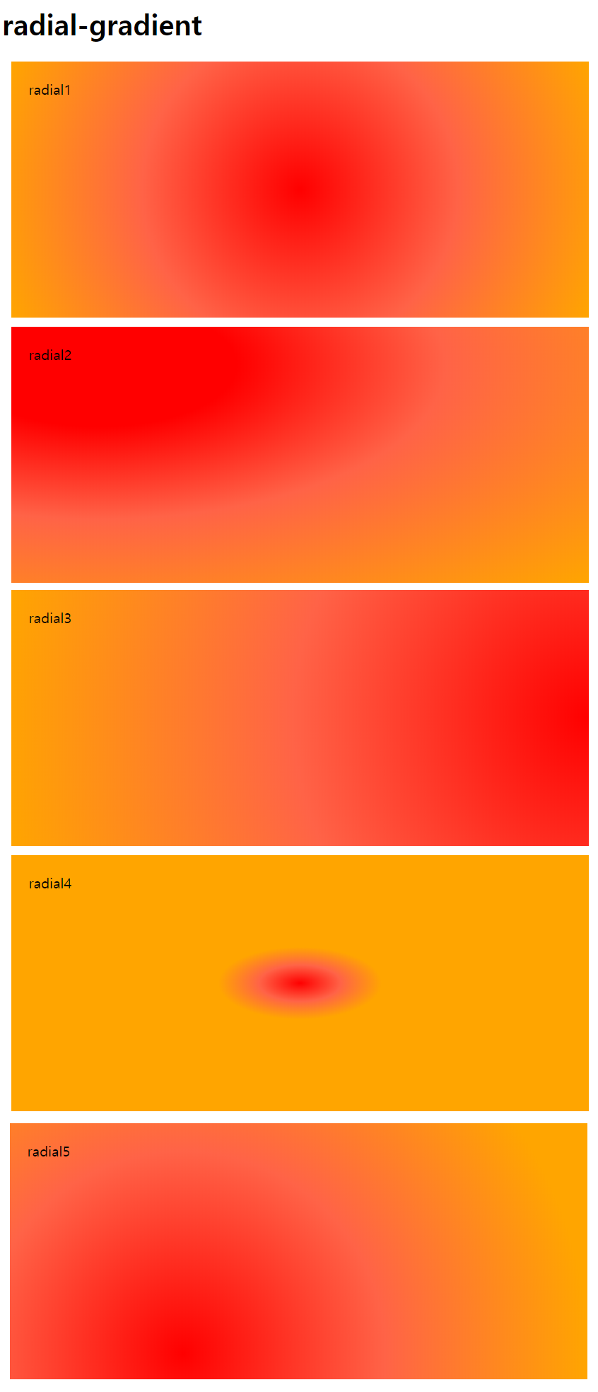
repeating-radial-gradient
repeating-radial-gradient 속성은 그라데이션을 반복한다.
<html>
    <head>
        <style>
            div {
                height: 250px;
                padding: 20px;
                margin: 10px;
            }
            .ra1 {
                background: repeating-radial-gradient(red, tomato 10%, orange 20%);
            }
            .ra2 {
                background: repeating-radial-gradient(circle at 15% 15%, red, tomato, orange 40%);
            }
        </style>
    </head>
    <body>
        <h1>repeating-radial-gradient</h1>
        <div class="ra1">1</div>
        <div class="ra2">2</div>
    </body>
</html>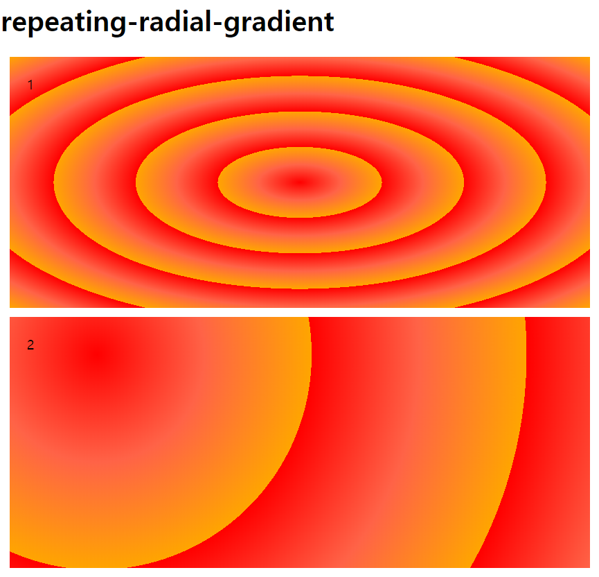
반응형
'CSS' 카테고리의 다른 글
| [CSS] Transform (65) | 2022.03.13 |
|---|---|
| [CSS] Transition (43) | 2022.03.12 |
| [CSS] Float (33) | 2022.03.10 |
| [CSS] Position (18) | 2022.03.08 |
| [CSS] z-index / overflow (4) | 2022.03.07 |
댓글