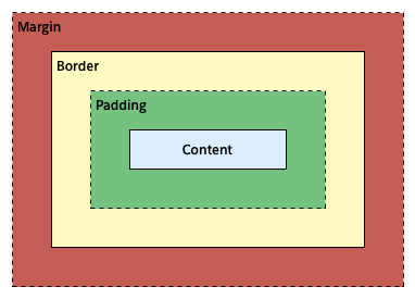
Box 모델
모든 HTML 요소들은 Box 형태의 영역(컨텐츠가 자리하는 영역)을 가지고 있으며 폭, 여백, 테두리 등의 속성들을 지정할 수 있다.
Content: 요소의 텍스트나 이미지 등 실제 내용이 위치하는 영역으로 width와 height 속성을 갖는다.Padding: 테두리 안쪽에 위치하는 요소의 내부 여백 영역이다.Border: 테두리 영역이다.Margin: 테두리 바깥에 위치하는 요소의 외부 여백 영역이다.
Width / Height
width와 height 속성은 요소의 너비와 높이를 지정하기 위해 사용하며 콘텐츠 영역을 대상으로 한다.
초기값은 auto 로써 이것은 브라우저가 상황에 따라 적당한 width와 height 값을 계산할 것을 의미한다.
값을 지정하기 위해서는 px, % 등의 크기 단위를 사용한다.
<html>
<head>
    <style>
        div {
            width: 300px;
            height: 300px;
            border: 1px solid black;
        }
    </style>
</head>
<body>
    <div>
        Lorem, ipsum dolor sit amet consectetur adipisicing elit.
        Id atque quibusdam ratione at ab molestias impedit nam? Deserunt,
        eius id. Nam dolorem quam, tenetur quidem dolores facere quod eveniet
        id.
    </div>
</body>
</html>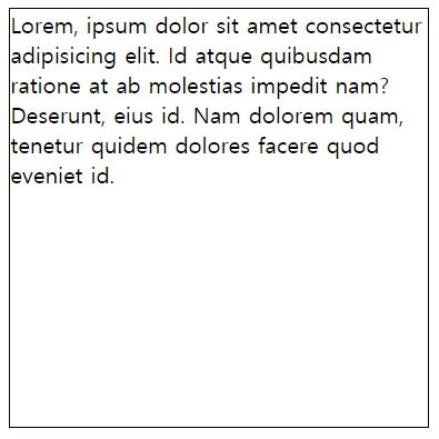
width와 height는 컨텐츠 영역을 대상으로 하기 때문에 박스 전체 크기는 다음과 같다.
- 전체너비
width + left padding + right padding + left border + right border + left margin + right margin - 전체 높이
height + top padding + bottom padding + top border + bottom border + top margin + bottom margin
Margin
테두리 바깥에 위치하는 요소의 외부 여백 영역으로 content의 4개 방향(top, bottom, left, right)에 대해 지정이 가능하다.
<html>
<head>
    <style>
        div {
            margin-top: 20px;
            margin-bottom: 20px;
            margin-left: 20px;
            margin-right: 20px;
            border: 1px solid black;
        }
    </style>
</head>
<body>
    <div>
        Lorem, ipsum dolor sit amet consectetur adipisicing elit.
        Id atque quibusdam ratione at ab molestias impedit nam? Deserunt,
        eius id. Nam dolorem quam, tenetur quidem dolores facere quod eveniet
        id.
    </div>
</body>
</html>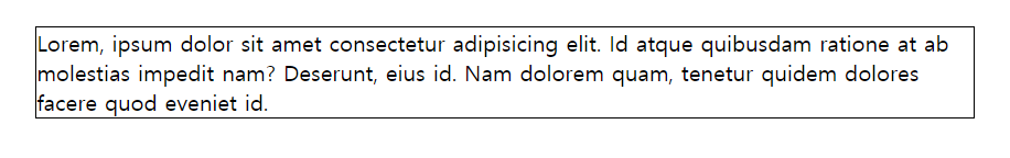
다음과 같이 축약하여 사용할 수 있다.
div {
    margin: 20px 50px 80px 100px;  /* top : 20px, right : 50px, bottom : 80px, left : 100px */
    margin: 20px 50px 100px;       /* top : 20px, right/left : 50px, bottom : 100px */
    margin: 20px 50px;             /* top/bottom : 20px, right/left : 50px */
    margin: 20px;                  /* top/right/left/bottom : 20px */
}
auto 키워드를 사용하면 해당 요소를 중앙에 위치시킬 수 있다.
<html>
<head>
    <style>
        div {
            width: 200px;
            height: 200px;
            margin: 0 auto; /* top/bottom : 0, right/left : auto */
            border: 1px solid black;
        }
    </style>
</head>
<body>
    <div>
        Lorem, ipsum dolor sit amet consectetur adipisicing elit.
        Id atque quibusdam ratione at ab molestias impedit nam? Deserunt,
        eius id. Nam dolorem quam, tenetur quidem dolores facere quod eveniet
        id.
    </div>
</body>
</html>
Padding
테두리 내부에 위치하는 요소의 외부 여백 영역으로 content의 4개 방향(top, bottom, left, right)에 대해 지정이 가능하다.
<html>
<head>
    <style>
        div {
            padding-top: 20px;
            padding-bottom: 20px;
            padding-left: 20px;
            padding-right: 20px;
            border: 1px solid black;
        }
    </style>
</head>
<body>
    <div>
        Lorem, ipsum dolor sit amet consectetur adipisicing elit.
        Id atque quibusdam ratione at ab molestias impedit nam? Deserunt,
        eius id. Nam dolorem quam, tenetur quidem dolores facere quod eveniet
        id.
    </div>
</body>
</html>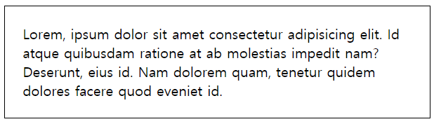
다음과 같이 축약하여 사용할 수 있다.
div {
    padding: 20px 50px 80px 100px;  /* top : 20px, right : 50px, bottom : 80px, left : 100px */
    padding: 20px 50px 100px;       /* top : 20px, right/left : 50px, bottom : 100px */
    padding: 20px 50px;             /* top/bottom : 20px, right/left : 50px */
    padding: 20px;                  /* top/right/left/bottom : 20px */
}
Border
테두리 영역을 의미하며 content의 4개 방향(top, bottom, left, right)에 대해 지정이 가능하다. 또한, 아래 각 속성별로도 4개 방향에 대한 지정이 가능하며 축약하여 사용할 수 있다.
border-style
border-style 속성은 테두리 선의 스타일을 지정한다.
<!DOCTYPE html>
<html>
<head>
    <style>
        p.all {
            border-style: solid dotted dashed double;
        }
        p.solid {
            border-style: solid;
        }
        p.dotted {
            border-top-style: dotted;
        }
        p.dashed {
            border-bottom-style: dashed;
        }
        p.double {
            border-right-style: double;
        }
        p.none {
            border-left-style: none;
        }
    </style>
</head>
<body>
    <p class="all">all</p>
    <p class="solid">solid</p>
    <p class="dotted">dotted</p>
    <p class="dashed">dashed</p>
    <p class="double">double</p>
    <p class="none">none</p>
</body>
</html>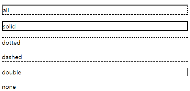
border-width
border-width 속성은 테두리의 두께를 지정한다. border-style 속성과 함께 사용해야 적용된다.
<html>
<head>
    <style>
        p {
            border-style: solid;
        }
        p.all {
            border-width: 1px 2px 5px 10px;
        }
        p.width {
            border-width: 5px;
        }
        p.width1 {
            border-top-width: 10px;
        }
    </style>
</head>
<body>
    <p class="all">all</p>
    <p class="width">width</p>
    <p class="width1">width1</p>
</body>
</html>
border-color
border-color 속성은 테두리의 색을 지정한다. border-style 속성과 함께 사용해야 적용된다.
<html>
<head>
    <style>
        p {
            border-style: solid;
        }
        p.all {
            border-color: red gray skyblue purple;
        }
        p.color {
            border-color: red;
        }
        p.color1 {
            border-bottom-color: blue;
        }
        p.color2 {
            border-right-color: tomato;
        }
    </style>
</head>
<body>
    <p class="all">all</p>
    <p class="color">color</p>
    <p class="color1">color1</p>
    <p class="color2">color2</p>
</body>
</html>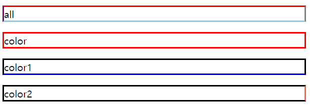
border-radius
border-radius 속성은 테두리 모서리를 둥글게 표현하도록 지정한다.
<html>
<head>
    <style>
        p {
            border-style: solid;
            width: 100px;
            height: 100px;
        }
        p.all {
            border-radius: 5px 10px 10% 20%;
        }
        p.radius {
            border-radius: 20px;
        }
        p.radius1 {
            border-top-left-radius: 50%;
        }
    </style>
</head>
<body>
    <p class="all">all</p>
    <p class="radius">radius</p>
    <p class="radius1">radius1</p>
</body>
</html>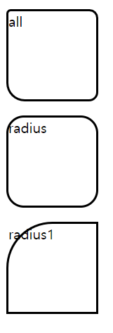
border
border 속성은 border-width, border-style, border-color의 축약 속성이다.
border: border-width border-style border-colorp {
border: 1px solid black;
}box-sizing
box-sizing 속성은 width, height 속성의 대상 영역을 변경할 수 있다.
| 속성 | 설명 |
|---|---|
| content-box | width, height 속성 값은 content 영역을 의미한다.(기본값) |
| border-box | width, height 속성 값은 content 영역, padding, border가 포함된 영역을 의미한다. |
<html>
    <head>
        <style>
            div {
                margin: 10px;
                width: 150px;
            }
            #contbox1 {
                border: 10px solid black;
                box-sizing: content-box;
            }
            #contbox2 {
                border: 30px solid black;
                box-sizing: content-box;
            }

            #border1 {
              border: 10px solid black;
              box-sizing: border-box;
            }
            #border2 {
                border: 30px solid black;
                box-sizing: border-box;
            }
        </style>
    </head>
    <body>
        <p>content-box</p>
        <div id="contbox1">Hello</div>
        <div id="contbox2">Hello</div>

        <p>border-box</p>
        <div id="border1">Hello</div>
        <div id="border2">Hello</div>
    </body>
</html>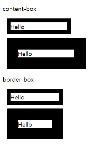
box-shadow
box-shadow 속성은 요소에 그림자를 지정한다.
선택자 {
    box-shadow: Insert Horizontal-offset Vertical-offset Blur-Radius Spread Shadow-Color
}| 속성 값 | 단위 | 설명 | 생략 |
|---|---|---|---|
| Inset | inset | 그림자가 요소 안쪽에 위치 | 가능 |
| Horizontal-offset | px | 그림자를 텍스트의 오른쪽으로 이동 | |
| Vertical-offset | px | 그림자를 텍스트의 아래쪽으로 이동 | |
| Blur-Radius | px | 그림자의 흐림도, 클수록 그림자가 커지고 흐려진다 | 가능 |
| Spread | px | 그림자 확장(음수, 양수) | 가능 |
| Shadow-Color | color | 그림자의 색상 | 가능 |
<html>
    <head>
        <style>
            div {
                width: 150px;
                height: 150px;
                padding: 20px;
                margin: 20px;
                background-color: tomato;
                float: left;
            }
            .shadow1 {
                box-shadow: 5px 4px;
            }
            .shadow2 {
                box-shadow: 5px 5px 10px blue;
            }
            .shadow3 {
                box-shadow: 0px 0px 10px 5px green;
            }
            .shadow4 {
                box-shadow: inset 5px 5px 10px 5px yellow;
            }
        </style>
    </head>
    <body>
        <h1>box-shadow</h1>
        <div class="shadow1">box-shadow test1</div>
        <div class="shadow2">box-shadow test2</div>
        <div class="shadow3">box-shadow test3</div>
        <div class="shadow4">box-shadow test4</div>
    </body>
</html>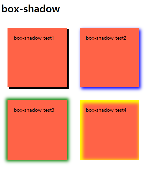
'CSS' 카테고리의 다른 글
| [CSS] 상속과 캐스케이딩 (0) | 2022.03.03 |
|---|---|
| [CSS] Visibility / Opacity (0) | 2022.03.02 |
| [CSS] Display (0) | 2022.03.02 |
| [CSS] 선택자 (0) | 2022.03.01 |
| [CSS] CSS란 (0) | 2022.02.28 |
댓글