grid
grid 속성은 2차원(행과 열)의 레아이웃 시스템을 제공하는 속성이다. flex 속성은 1차원 레이아웃을 위하는 속성이며, grid는 2차원으로써 좀 더 편한 레이아웃을 구성할 수 있도록 도와준다.
grid item이라는 자식 요소와 grid container라는 부모 요소가 있으며 grid container에 대한 정보는 아래 글 참고.
[CSS] Grid(1)
grid grid 속성은 2차원(행과 열)의 레아이웃 시스템을 제공하는 속성이다. flex 속성은 1차원 레이아웃을 위하는 속성이며, grid 는 2차원으로써 좀 더 편한 레이아웃을 구성할 수 있도록 도와준다. gr
ypangtrouble.tistory.com
grid item
grid 레이아웃 중 부모 요소에 해당하며 grid item이라는 복수의 자식 요소들을 포함하고 있다.
| 속성 | 설명 |
|---|---|
| grid-row-start | item의 행 시작 위치 |
| grid-row-end | item의 행 끝 위치 |
| grid-row | grid-row-의 축약 |
| grid-column-start | item의 열 시작 위치 |
| grid-column-end | item의 열 끝 위치 |
| grid-column | grid-column-의 축약 |
| grid-area | 영역 이름을 설정하거나, grid-row와 grid-column의 축약 |
| align-self | item의 수직방향(열 축) 정렬 |
| justify-self | item의 수평방향(행 축) 정렬 |
| place-self | align-self와 justify-self의 축약 |
| order | item의 배치 순서 |
| z-index | item의 쌓이는 순서 |
grid-row-start / grid-row-end, grid-column-start / grid-column-end
grid-row-start 속성과 grid-row-end 속성은 행의 '시작 위치'와 '끝 위치', grid-column-start 속성과 grid-column-end 속성은 열의 시작 위치'와 '끝 위치'를 지정하며 그리드 item을 배치하기 위해 사용한다.span` 키워드에 '숫자'를 지정하면 '숫자'만큼 라인을 확장한다.
<html>
    <head>
        <style>
            .container {
                display: grid;
                height: 500px;
                width: 480px;
                background-color: skyblue;
                grid-template-rows: repeat(3, 100px);
                grid-template-columns: repeat(3, 100px);
            }
            #item {
                border: 1px solid black;
                background-color: springgreen;
            }
            .item1 {
                /* row 1번에서 4번까지(1+3) */
                grid-row-start: 1;
                grid-row-end: span 3;

                grid-column-start: 1;
                grid-column-end: 3;
            }
            .item2 {
                grid-row-start: 2;
                grid-row-end: 4;
                /* column 3번에서 4번까지(3+1) */
                grid-column-start: 3;
            }
        </style>
    </head>
    <body>
        <h1>grid-row/column-start/end</h1>
        <div class="container">
            <div class="item1" id="item">1</div>
            <div class="item2" id="item">2</div>
        </divc>
    </body>
</html>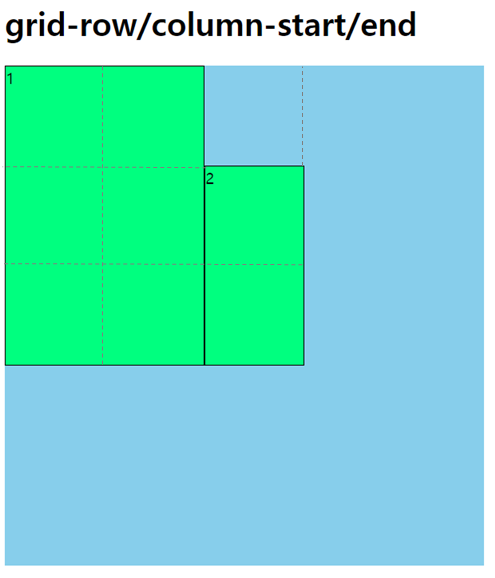
grid-row
grid-row 속성은 grid-row-start와 grid-row-end를 설정하기 위한 축약 속성이다. 각 속성을 /로 구분한다.
.item {
    grid-row: grid-row-start / grid-row-end;
}
.item1 {
grid-row-start: 1;
grid-row-end: span 3;
}
.item1 {
grid-row: 1 / span 3;
}
.item1 {
grid-row: 1 / 4;
}grid-column
grid-column 속성은 grid-column-start와 grid-column-end의 축약 속성이다. 각 속성을 /로 구분한다.
.item {
    grid-row: grid-column-start / grid-column-end;
}
.item1 {
grid-column-start: span 2;
grid-column-end: 4;
}
.item1 {
grid-column: span 2 / 4;
}
.item1 {
grid-column: 2 / 4;
}grid-area
grid-area 속성은 다음의 두 가지 의미를 가지고 있다.
grid-row-start,grid-row-end,grid-column-start,grid-column-end의 축약 속성grid-template-areas가 참조할 영역의 이름
.item {
    grid-area: <grid-row-start> / <grid-column-start> / <grid-row-end> /  <grid-column-end>;
    grid-area: 영역이름;
}
.item {
grid-row: 2 / 4;
grid-column: span2 / 5;
}
.item {
grid-area: 2 / span2 / 4 / 5;
} .container {
display: grid;
width: 300px;
grid-template-rows: repeat(3, 100px);
grid-template-columns: repeat(3, 100px);
grid-template-areas:
"header header header"
"nav . main"
"footer footer footer";
}
.header { grid-area: header; }
.main { grid-area: main; }
.nav { grid-area: nav; }
.footer { grid-area: footer; } align-self
align-self 속성은 단일 그리드 item을 수직 방향(열 축) 기준으로 정렬한다.
그리드 item의 높이가 자신이 속한 그리드 셀의 높이보다 작아야 한다.
| 값 | 의미 | 기본값 |
|---|---|---|
| normal | stretch와 동일 |
normal |
| start | item을 시작점으로 정렬 | |
| end | item을 끝점으로 정렬 | |
| center | item을 가운데 정렬 | |
| stretch | Container의 수직방향 축(높이)을 채우기 위해 item을 늘림 |
<html>
    <head>
        <style>
            .container {
                display: grid;
                height: 300px;
                width: 300px;
                background-color: skyblue;
                grid-template-rows: repeat(2, 1fr);
                grid-template-columns: repeat(2, 1fr);
            }
            #item {
                border: 1px solid black;
                background-color: springgreen;
            }
            .item1 {
                width: 100px;
                height: 100px;
                align-self: start;
            }
            .item2 {
                width: 100px;
                height: 100px;
                align-self: end;
            }
            .item3 {
                width: 100px;
                height: 100px;
                align-self: center;
            }
            .item4 {
                width: 100px;
                align-self: stretch;
            }
        </style>
    </head>
    <body>
        <h1>align-self</h1>
        <div class="container">
            <div class="item1" id="item">start</div>
            <div class="item2" id="item">end</div>
            <div class="item3" id="item">center</div>
            <div class="item4" id="item">stretch</div>
        </divc>
    </body>
</html>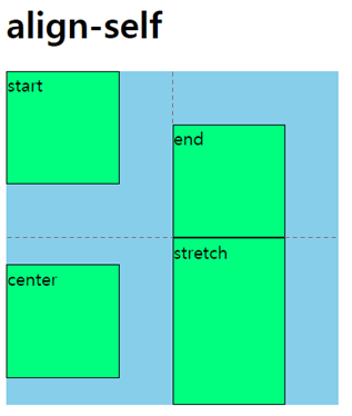
justify-self
justify-self 속성은 단일 그리드 item을 수평 방향(행 축) 기준으로 정렬한다.
그리드 item의 너비가 자신이 속한 그리드 셀의 너비보다 작아야 한다.
| 값 | 의미 | 기본값 |
|---|---|---|
| normal | stretch와 동일 |
normal |
| start | item을 시작점으로 정렬 | |
| end | item을 끝점으로 정렬 | |
| center | item을 가운데 정렬 | |
| stretch | Container의 수직방향 축(높이)을 채우기 위해 item을 늘림 |
<html>
    <head>
        <style>
            .container {
                display: grid;
                height: 300px;
                width: 300px;
                background-color: skyblue;
                grid-template-rows: repeat(2, 1fr);
                grid-template-columns: repeat(2, 1fr);
            }
            #item {
                border: 1px solid black;
                background-color: springgreen;
            }
            .item1 {
                width: 100px;
                height: 100px;
                justify-self: start;
            }
            .item2 {
                width: 100px;
                height: 100px;
                justify-self: end;
            }
            .item3 {
                width: 100px;
                height: 100px;
                justify-self: center;
            }
            .item4 {
                height: 100px;
                justify-self: stretch;
            }
        </style>
    </head>
    <body>
        <h1>justify-self</h1>
        <div class="container">
            <div class="item1" id="item">start</div>
            <div class="item2" id="item">end</div>
            <div class="item3" id="item">center</div>
            <div class="item4" id="item">stretch</div>
        </divc>
    </body>
</html>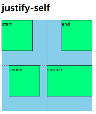
place-self
place-self속성은 align-self와 justify-self의 축약 속성이다.
.item {
    place-self: <align-self> <justify-self>;
}
.item {
place-self: start end;
}
.item {
align-self: start;
justify-self: end;
}.item {
place-self: center;
}
.item {
align-self: center;
justify-self: center;
}order
order속성은 item이 자동 배치되는 순서를 변경하는 속성이다. 숫자가 작을수록 우선 배치된다.
<html>
    <head>
        <style>
            .container {
                display: grid;
                height: 300px;
                width: 300px;
                background-color: skyblue;
                grid-template-rows: repeat(3, 1fr);
                grid-template-columns: repeat(3, 1fr);
            }
            #item {
                border: 1px solid black;
                background-color: springgreen;
            }
            .item1 {
                order: 10;
            }
            .item2 {
                order: 1;
            }
            .item3 {
                order: 0;
            }
            .item4 {
                order: -3;
            }
        </style>
    </head>
    <body>
        <h1>order</h1>
        <div class="container">
            <div class="item1" id="item">1</div>
            <div class="item2" id="item">2</div>
            <div class="item3" id="item">3</div>
            <div class="item4" id="item">4</div>
        </divc>
    </body>
</html>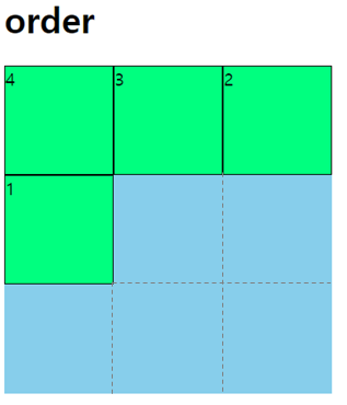
z-index
z-index 속성을 이용하여 item이 쌓이는 순서를 변경할 수 있다. 숫자가 클수록 가장 나중에 쌓이게 된다.
 .container {
    display: grid;
    height: 300px;
    width: 300px;
    border: 1px solid black;
    background-color: white;
    grid-template-rows: repeat(3, 100px);
    grid-template-columns: repeat(3, 100px);
}
.item1 { grid-area: 1 / 1 / 2 / 4; background-color: tomato; }
.item2 { grid-area: 2 / 1 / 4 / 3; z-index: 2; background-color: skyblue; }
.item3 { grid-area: 1 / 2 / 4 / 3; z-index: 1; background-color: greenyellow; }
.item4 { grid-area: 3 / 2 / 4 / 4; z-index: 4; background-color: wheat; }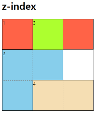
grid unit
그리드에서 사용하는 단위는 다음과 같다.
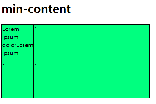
min-content
min-content는 그리드 item이 포함하는 내용의 최소 크기를 의미한다.
.container {
    display: grid;
    width: 400px;
    border: 1px solid black;
    background-color: white;
    grid-template-rows: repeat(2,100px);
    grid-template-columns: min-content auto ;
}
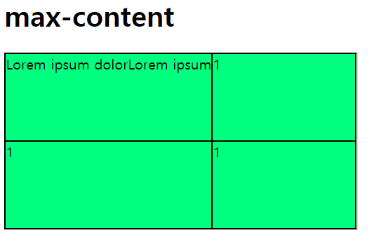
max-content
max-content는 그리드 item이 포함하는 내용의 최대 크기를 의미한다.
.container {
    display: grid;
    width: 400px;
    border: 1px solid black;
    background-color: white;
    grid-template-rows: repeat(2,100px);
    grid-template-columns: max-content auto ;
}
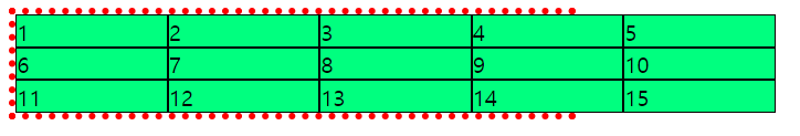
auto-fill / auto-fit
auto-fill과 auto-fit 함수는 행/열의 개수를 그리드 container 및 행/열 크기에 맞게 자동으로 조정한다.
주로 repeat() 함수와 같이 사용하며, 행/열 item의 개수가 명확하지 않을 때 유용하다.
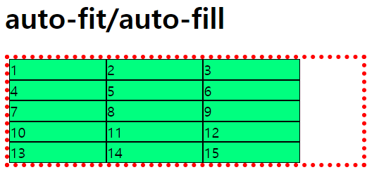
110px 짜리 열을 5개 만들었을 때 그리드 container의 크기가 item들의 너비 합(550px)보다 작다면(400px) 아래와 같이 item들은 넘치게 된다.
.container {
    display: grid;
    width: 400px;
    border: 5px dotted red;
    background-color: white;
    grid-template-rows: repeat(3,auto);
    grid-template-columns: repeat(5, 110px) ;
}
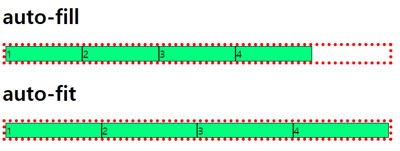
그러나 굳이 item의 개수 5개를 유지할 필요가 없다면 auto-fill, auto-fit 함수를 이용하여 동적으로 위치를 변경할 수 있다.
container 너비가 item들을 모두 수용할 수 없을 경우 자동으로 줄 바꿈 처리한다.
.container {
    display: grid;
    width: 400px;
    border: 5px dotted red;
    background-color: white;
    grid-template-rows: repeat(3,auto);
    grid-template-columns: repeat(auto-fill /*auto-fit*/, 110px) ;
}
auto-fill과 auto-fit의 차이는 그리드 item들을 모두 수용하고 난 후에도 container의 공간이 남아 있을 때 나타난다.(container의 너비 > item들의 너비)
auto-fill: 남는 공간을 그대로 유지한다.auto-fit: item 크기를 늘려 남는 공간을 모두 메운다.
.container_autofill {
    grid-template-columns: repeat(auto-fill, minmax(110px,1fr)) ;
}

.container_autofit {
    grid-template-columns: repeat(auto-fit, minmax(110px,1fr)) ;
}
grid function
그리드에서 자주 사용하는 함수들은 다음과 같다
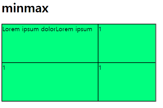
minmax
minmax() 함수는 행/열의 '최소/최대 크기'를 정의한다. 첫 번째 인수는 최솟값이고 두 번째 인수는 최댓값이다.
.container {
    display: grid;
    width: 400px;
    border: 1px solid black;
    background-color: white;
    grid-template-rows: repeat(2,100px);
    grid-template-columns: minmax(100px, 250px) minmax(10px, 150px) ;
}
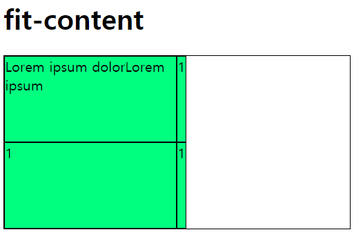
fit-content
fit-content() 함수는 행/열의 크기를 그리드 item이 포함하는 내용 크기에 맞춘다. 인수는 내용의 최대 크기를 의미한다.
첫 번째 열의 크기는 200px, 두 번째 열의 크기를 300px로 주었지만 첫 번째 열의 내용은 200px 보다 크기 때문에 200px 만큼 할당 되었고 두 번째 열의 내용은 200px보다 훨씬 작기 때문에 300px로 주어도 내용의 크기만큼만 할당 되었다.
.container {
    display: grid;
    width: 400px;
    border: 1px solid black;
    background-color: white;
    grid-template-rows: repeat(2,100px);
    grid-template-columns: fit-content(200px) fit-content(300px) ;
}
'CSS' 카테고리의 다른 글
| [CSS] CSS 문법 정리 (32) | 2023.12.13 |
|---|---|
| [CSS] 애니메이션(Animation) (52) | 2022.03.18 |
| [CSS] Grid(1) (76) | 2022.03.16 |
| [CSS] Flexbox(2) (61) | 2022.03.15 |
| [CSS] Flexbox(1) (81) | 2022.03.14 |
댓글